"In what ways does your media product use, develop or challenge forms and conventions of real media products?"
I believe that our media product follows similar patterns to real media products, making it as professional as the music videos in the industry. We, however, did certain things differently in order to challenge certain aspects.
A typical music video would have focus on the main artist all throughout, consisting of a lot of close ups, mid shots and screen time on the main artist themselves. However, considering our main artist is a producer (Arcane), we wanted to use the metaphor of them being 'behind the scenes', as they would when producing the music itself. Therefore, we intentionally chose to give the vocalist (Dan Davids) that Arcane was working with, more screen time and more focus. This goes against the convention of having focus on the main artist, as the main artist makes a slight cameo, rather than being in the limelight from beginning to end.
We used slow motion in our product, mid shots, close ups and cut the video to match the timing of the audio. These are all techniques we found in our research of actual music videos.
Monday, 9 November 2015

Thursday, 5 November 2015
Canary Wharf- Location
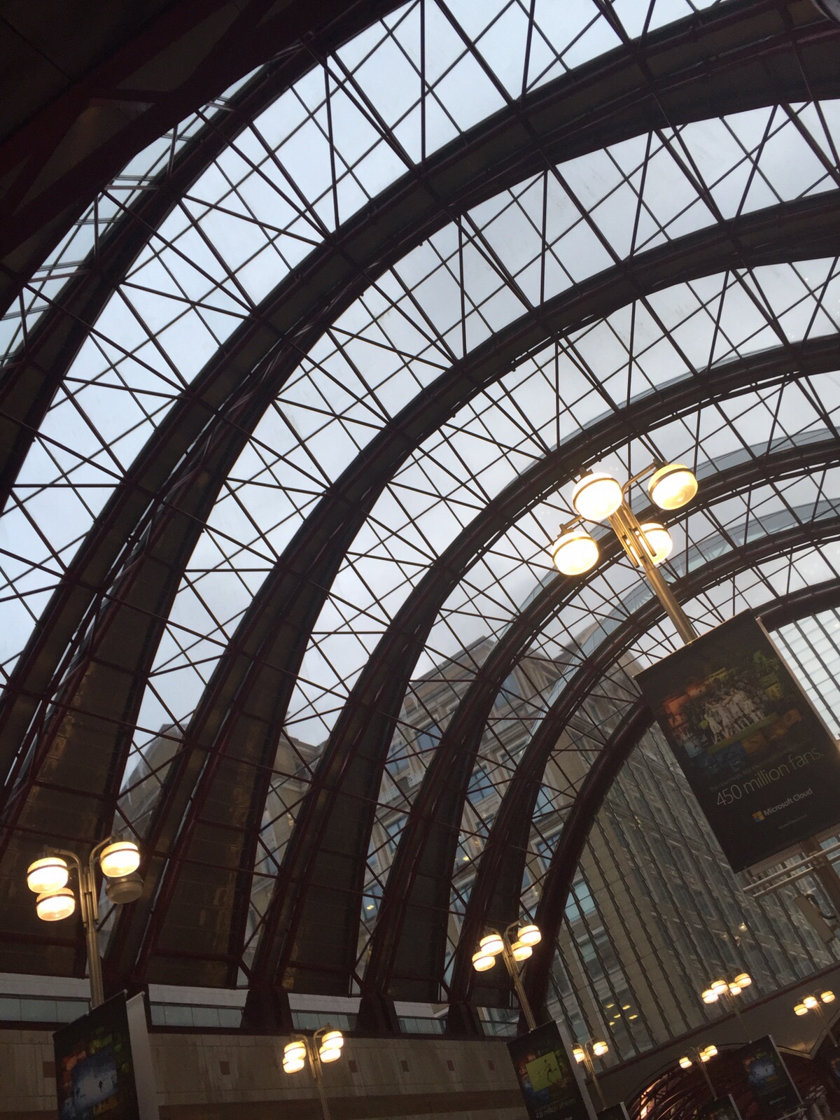
Seun went to Canary Wharf DLR station in order to see the lighting that's already there which will give us a good idea of how it will work when filming at night. The station is well lit which will be very useful for our opening shots. Also it can look very nice (when quiet), whilst having a roof over it, preventing rain from affecting our shoot. We will be shooting there on Sunday evening.


Tuesday, 3 November 2015
Reflection on Blogging Health Check 2
I found the comments on my blogging health check were well deserved. A lot of work has been put in from myself in order to push my blogging back to a higher standard, making me vary in terms of ICT, what information is spoken about, etc. Having said that, there'll always be room for improvement and that is something I continue to strive for.
Monday, 2 November 2015
24 | Digipak initial ideas
Digipak

This is a rough idea for the CD cover made by Seun. It includes the custom face art that we made with inspiration from Disclosure's face outline. One of our ideas for the album name is Voltage which goes with the light blue all-round colour scheme of the cover. As of now the design is too simple so if we were to develop on this idea we would have to make it more eye-catching with maybe a change in the fonts, colour scheme, pictures or interpreting the eye more as that is our synergy base.
Update on filming scheldule
On this following day in our three hour lesson as a group we wasn't able to carry on our filming as one of our group members didn't turn up. The main reason why this was a problem was because we was using his equipment and not the college equipment meaning their was no alternative. If we was filming with the college equipment we could of managed doing it with the people that did turn up. This has made us a bit behind , but because we are using our own equipment we will have to catch up in our own time with the time that we have missed out on.
Subscribe to:
Posts (Atom)